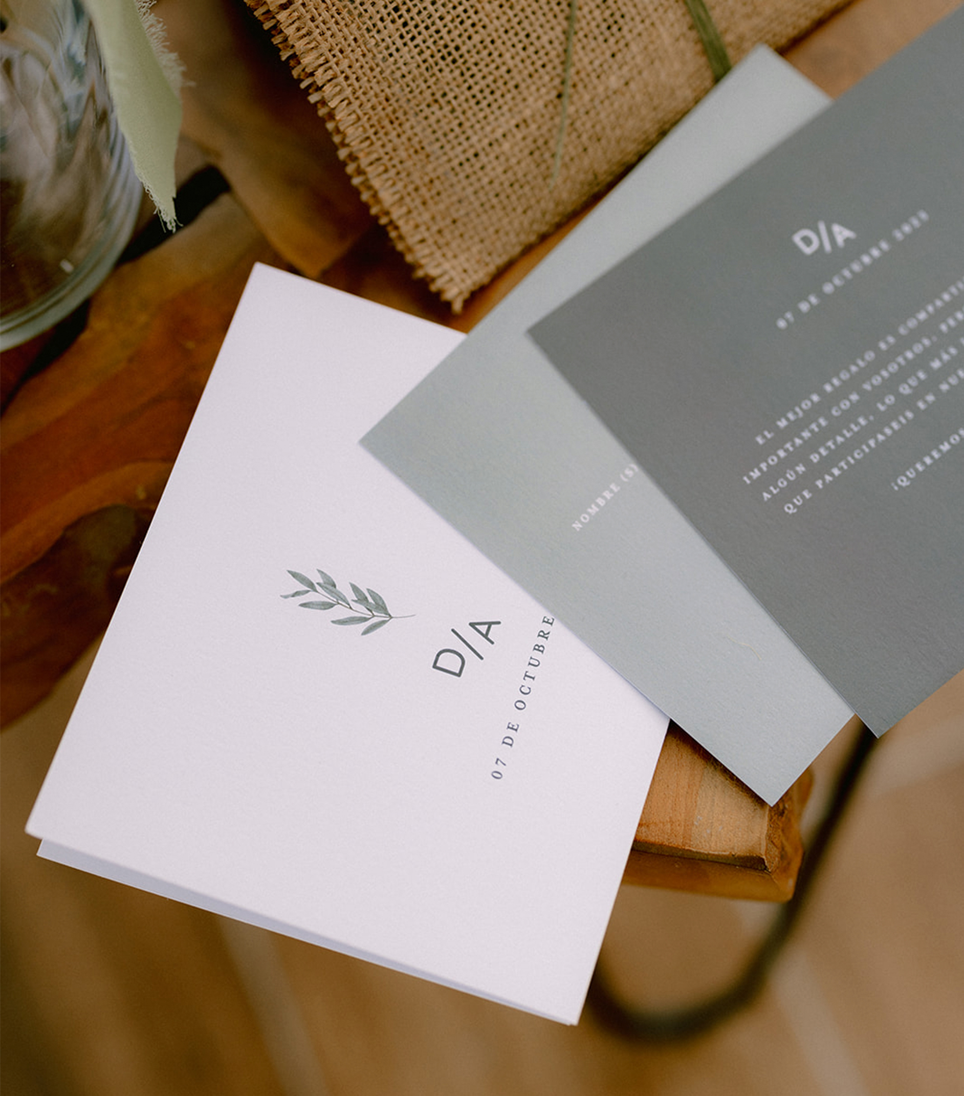
«D/A» means the acronym of Diego and Ana’s names. This wedding branding was comprised of the design of invitations, handmade invitation envelopes, seating plans, menus, labels, and handmade gifts.
Acronyms
The use of acronyms instead of names had the objective of creating a minimalist and elegant design where the rule of thumb is to focus solely on important elements.
Quicksands
Geometric font with rounded terminals which gives it a very nice and approachable look.
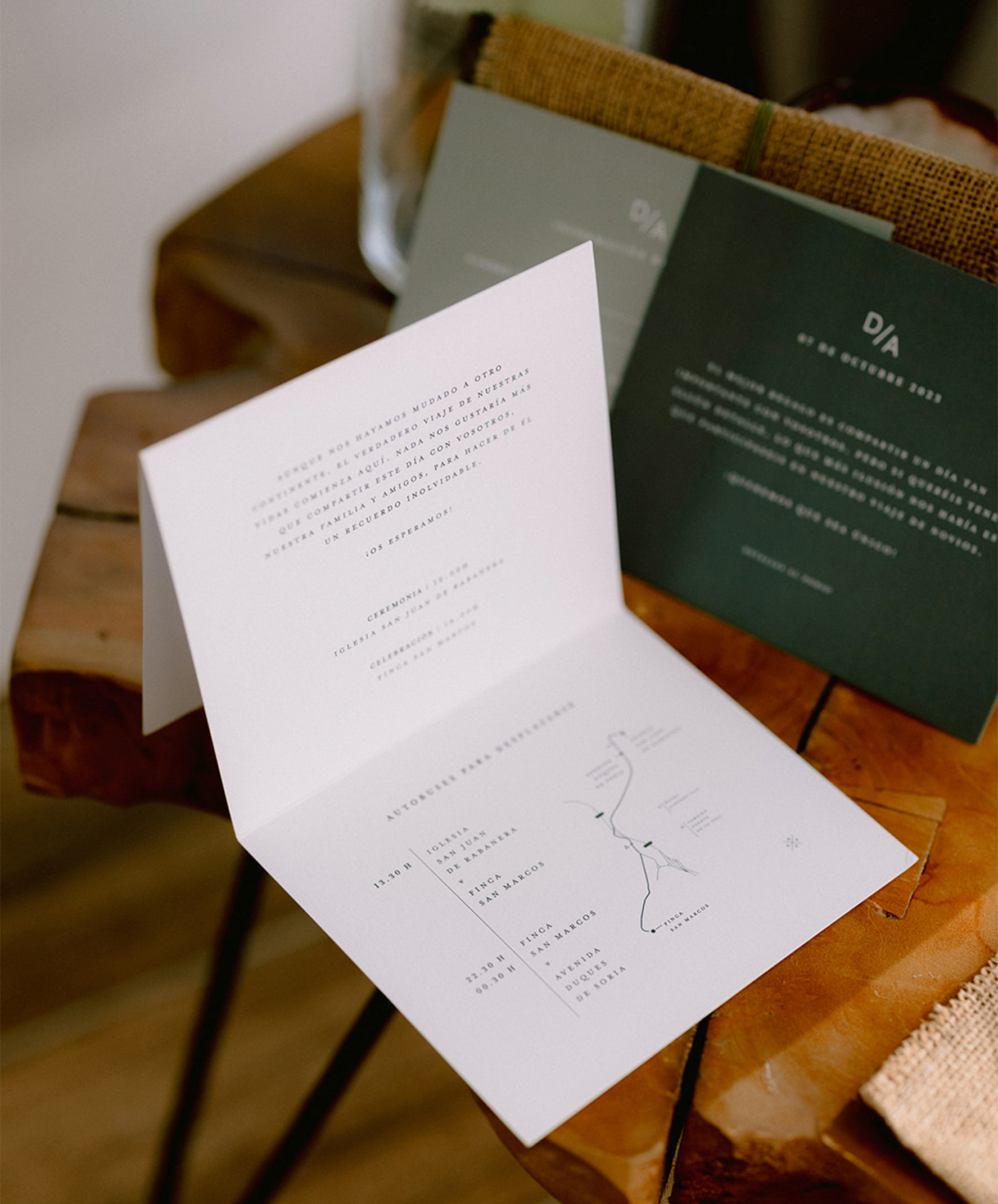
Conqueror paper (300gr.)
Features parallel watermarks which create a ribbed appearance for elegant effect. Its texture makes it have a unique and subtle touch when you touch it. The high grammage reflects durability, not only because it means more quality of design, but also because it refers to the fact that marriage is an act for life.
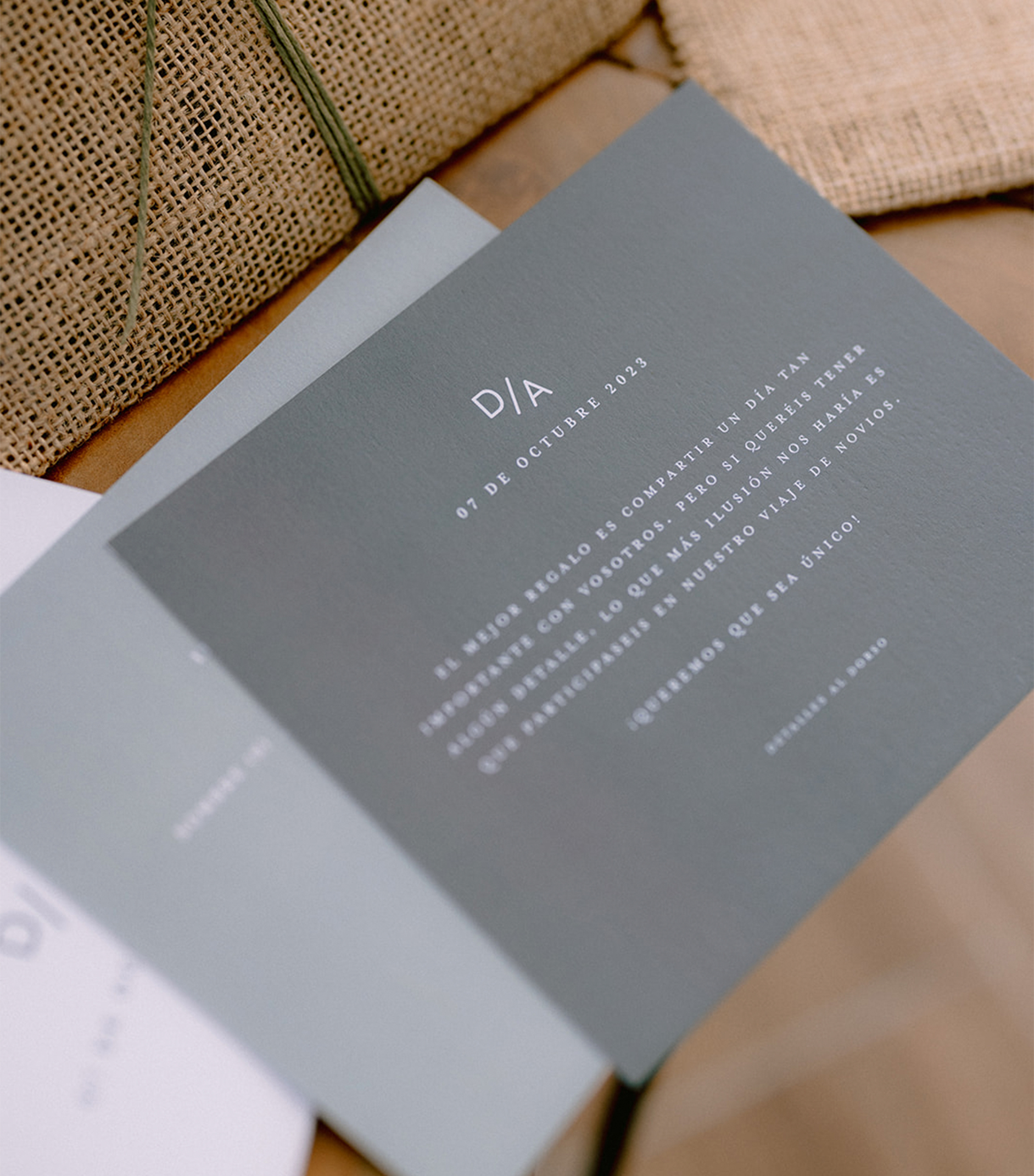
Typography text
Mrs Eaves XL Serif Nar OT Bold
This kind of font works well as a compact text face while maintaining the full characteristics of the «regular» size, The larger x-height of this kind of font maintains superior readability at smaller point sizes. Besides that, the use of capital letters is chosen o give the importance of the event.
Olive tree
It’s simple and country chic, yet elegant and refined in a typical Spanish Mediterranean style, where the bride is coming from.
As a millenary plant, the olive tree has been considered, since ancient times, a transcendent symbol of peace, wealth, and prosperity.
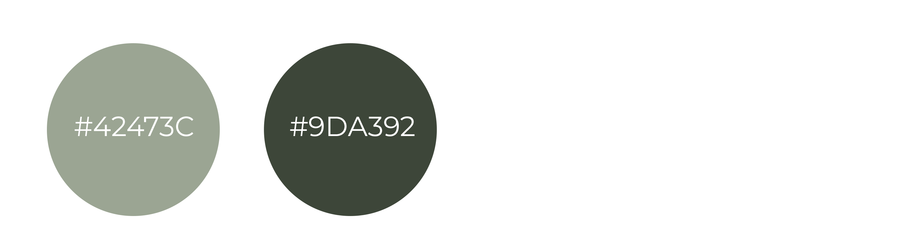
Colors
The entire brand project references the olive tree as using two different green palettes plus a white color.
Envelops
Unique and personalized invitations with a bohemian chic style using jute fabric. To harden the edges was used white glue mixed with water to ensure durability and structure. Once dry, was created a small pocket by sewing a section of the sides adds a functional and decorative element to the envelope.
The choice of green hemp twine for closing the envelope adds a natural and minimalist touch, complementing the olive color theme of the entire project. Additionally, incorporating a preserved stem of white paniculata not only enhances the aesthetic appeal but also contributes to the romantic and bohemian chic style.
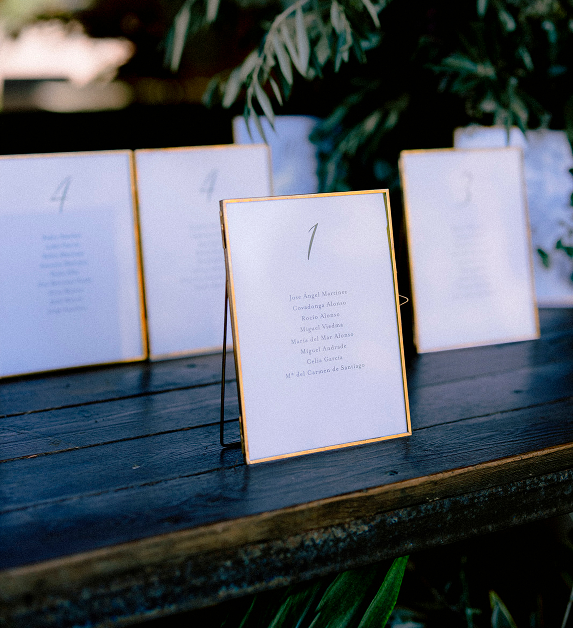
Seating plan
Using the same font for most of the text creates consistency and a cohesive look, while incorporating a handwritten font for the numbers adds a personalized touch and a unique element to the design.
Avalon Regular
Menu
The same style and typographies as the invitation adding an olive branch illustration following the topic design.
"D/A" means the acronym of Diego and Ana's names. This wedding branding was comprised of the design of invitations, handmade invitation envelopes, seating plans, menus, labels, and handmade gifts.
Acronyms
The use of acronyms instead of names had the objective of creating a minimalist and elegant design where the rule of thumb is to focus solely on important elements.
Quicksands
Geometric font with rounded terminals which gives it a very nice and approachable look.
Conqueror paper (300gr.)
Features parallel watermarks which create a ribbed appearance for elegant effect. Its texture makes it have a unique and subtle touch when you touch it. The high grammage reflects durability, not only because it means more quality of design, but also because it refers to the fact that marriage is an act for life.
Typography
Mrs Eaves XL Serif Nar OT Bold
This kind of font works well as a compact text face while maintaining the full characteristics of the «regular» size, The larger x-height of this kind of font maintains superior readability at smaller point sizes. Besides that, the use of capital letters is chosen o give the importance of the event.
Olive branch
It’s simple and country chic, yet elegant and refined in a typical Spanish Mediterranean style, where the bride is coming from.
As a millenary plant, the olive tree has been considered, since ancient times, a transcendent symbol of peace, wealth, and prosperity.
Colors
The entire brand project references the olive tree as using two different green palettes plus a white color.
Envelops
Unique and personalized invitations with a bohemian chic style using jute fabric. To harden the edges was used white glue mixed with water to ensure durability and structure. Once dry, was created a small pocket by sewing a section of the sides adds a functional and decorative element to the envelope.
The choice of green hemp twine for closing the envelope adds a natural and minimalist touch, complementing the olive color theme of the entire project. Additionally, incorporating a preserved stem of white paniculata not only enhances the aesthetic appeal but also contributes to the romantic and bohemian chic style.
Seating plan
Using the same font for most of the text creates consistency and a cohesive look while incorporating a handwritten font for the numbers adds a personalized touch and a unique element to the design.
Avalon Regular
Menu
The same style and typographies as the invitation adding an olive branch illustration following the topic design.
The use of acronyms instead of names had the objective of creating a minimalist and elegant design where the rule of thumb is to focus solely on important elements.
Quicksands
Geometric font with rounded terminals which gives it a very nice and approachable look.
Conqueror paper (300gr.)
Features parallel watermarks which create a ribbed appearance for elegant effect. Its texture makes it have a unique and subtle touch when you touch it. The high grammage reflects durability, not only because it means more quality of design, but also because it refers to the fact that marriage is an act for life.
Typography text
Mrs Eaves XL Serif Nar OT Bold
This kind of font works well as a compact text face while maintaining the full characteristics of the «regular» size, The larger x-height of this kind of font maintains superior readability at smaller point sizes. Besides that, the use of capital letters is chosen to give the importance of the event.
Olive branch
It’s simple and country chic, yet elegant and refined in a typical Spanish Mediterranean style, where the bride is coming from.
As a millenary plant, the olive tree has been considered, since ancient times, a transcendent symbol of peace, wealth, and prosperity.
Colors
The entire brand project references the olive tree as using two different green palettes plus a white color.
Envelops
Unique and personalized invitations with a bohemian chic style using jute fabric. To harden the edges was used white glue mixed with water to ensure durability and structure. Once dry, was created a small pocket by sewing a section of the sides adds a functional and decorative element to the envelope.
The choice of green hemp twine for closing the envelope adds a natural and minimalist touch, complementing the olive color theme of the entire project. Additionally, incorporating a preserved stem of white paniculata not only enhances the aesthetic appeal but also contributes to the romantic and bohemian chic style.
Seating plan
Using the same font for most of the text creates consistency and a cohesive look while incorporating a handwritten font for the numbers adds a personalized touch and a unique element to the design.
Avalon Regular
Menu
The same style and typographies as the invitation adding an olive branch illustration following the topic design.